For the health-conscious, adventurous consumer, Oocha Brew is the top choice probiotic kombucha brand for it’s fresh take flavors an aesthetics without compromising any of the benefits of this fizzy, fermented tea drink.
Oocha Brew probiotic kombucha
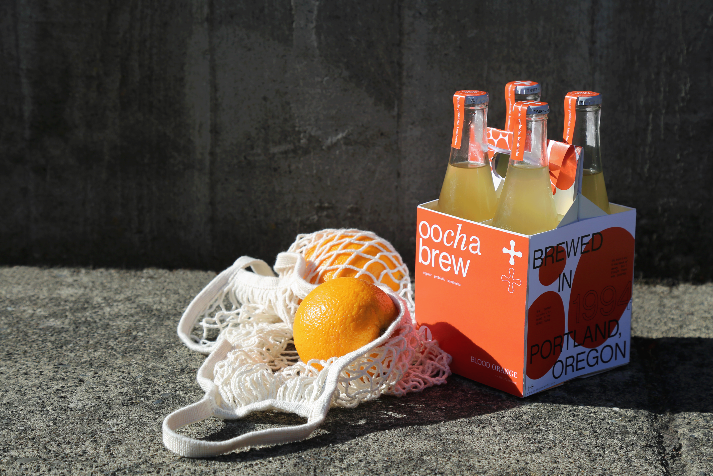
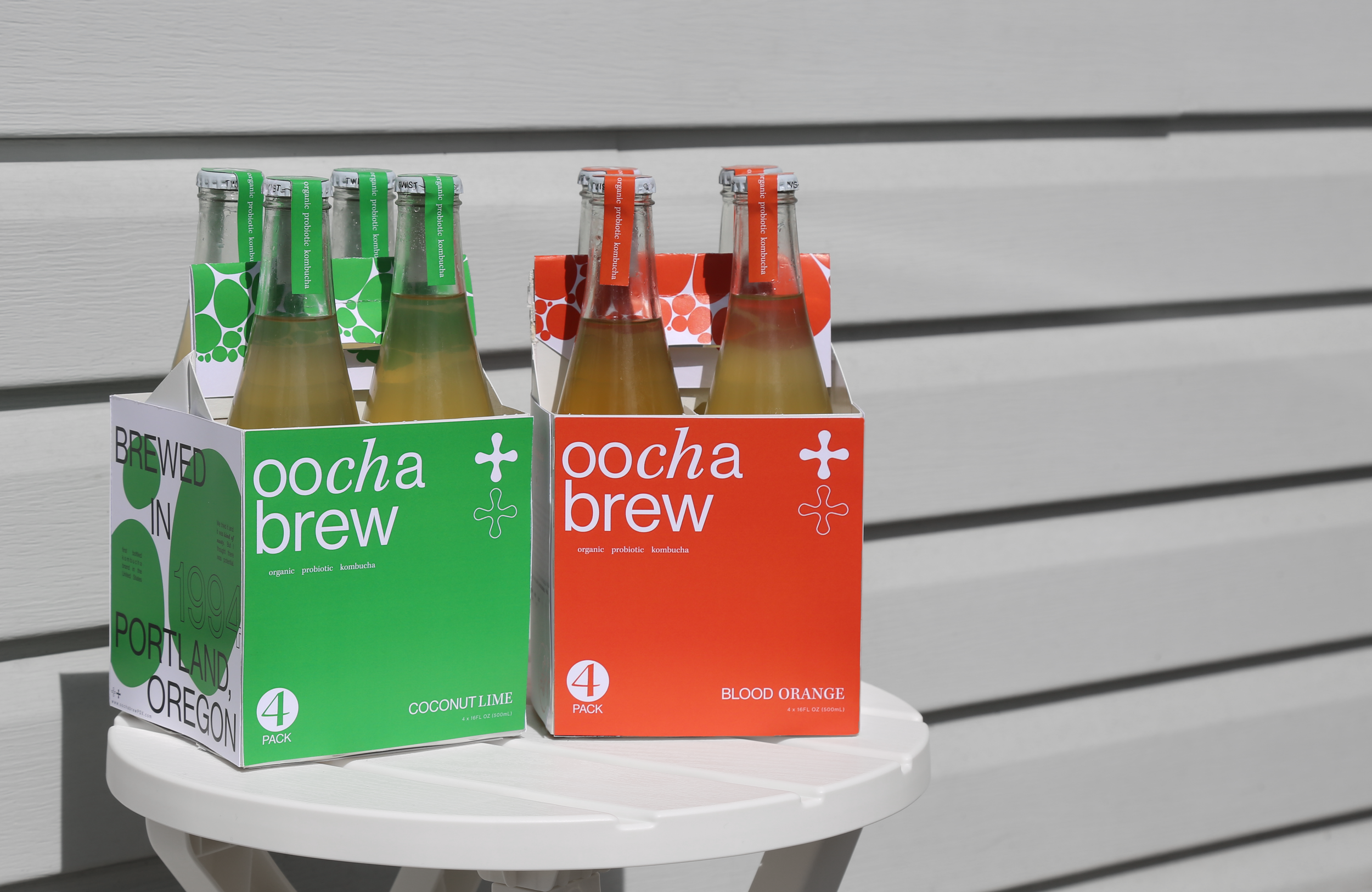
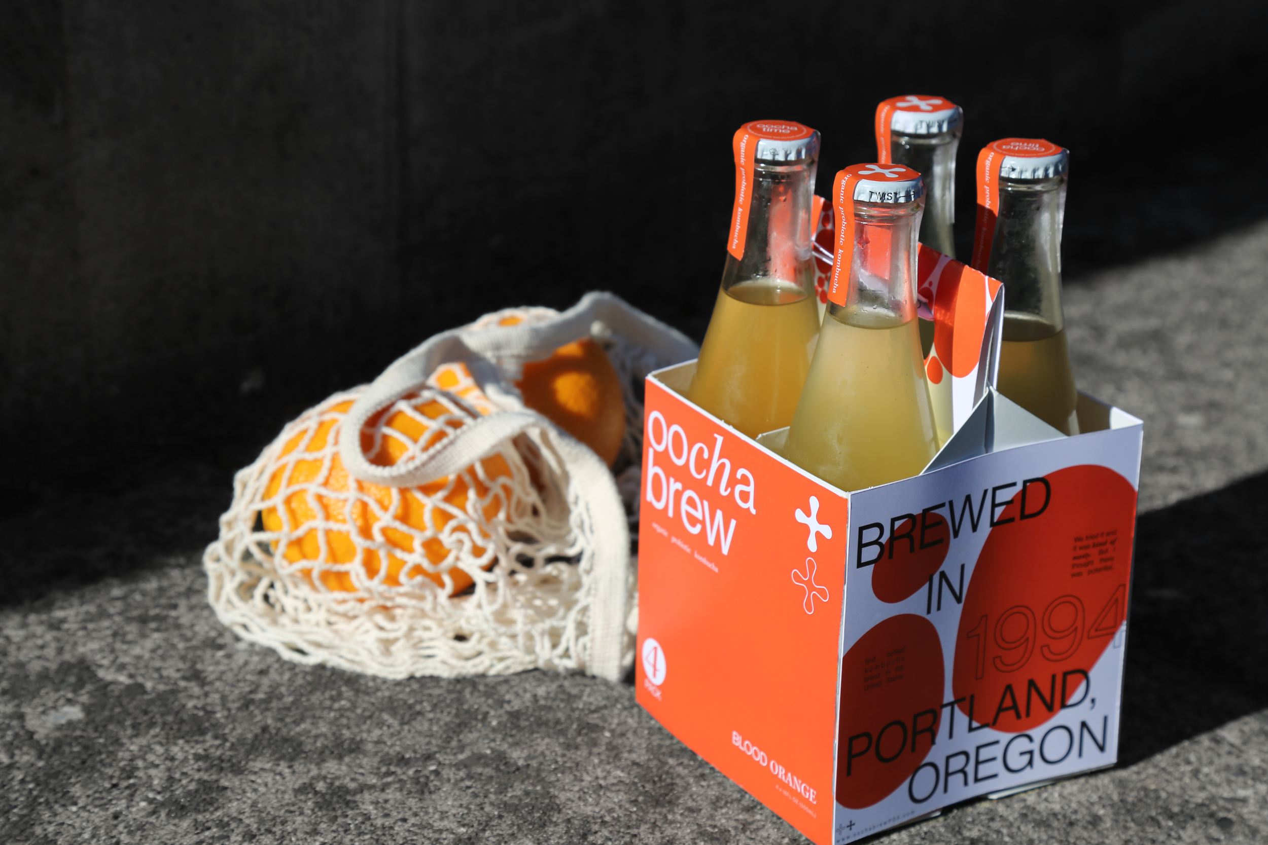
BrandingPackagingPhotographyConceptingOocha Brew is a kombucha company from Portland, Oregon. It was the first bottled kombucha brand to hit the shelves in the United States. After a short career in the kombucha industry, the company retired and returned to the business years later under a new name.
I was tasked with creating a 4 or 6 pack of bottles with an accompanied box. Selecting from beverages that are from the past and looking to the future of how these drink brands can exist in the modern day.


Fun, Funky Fizz
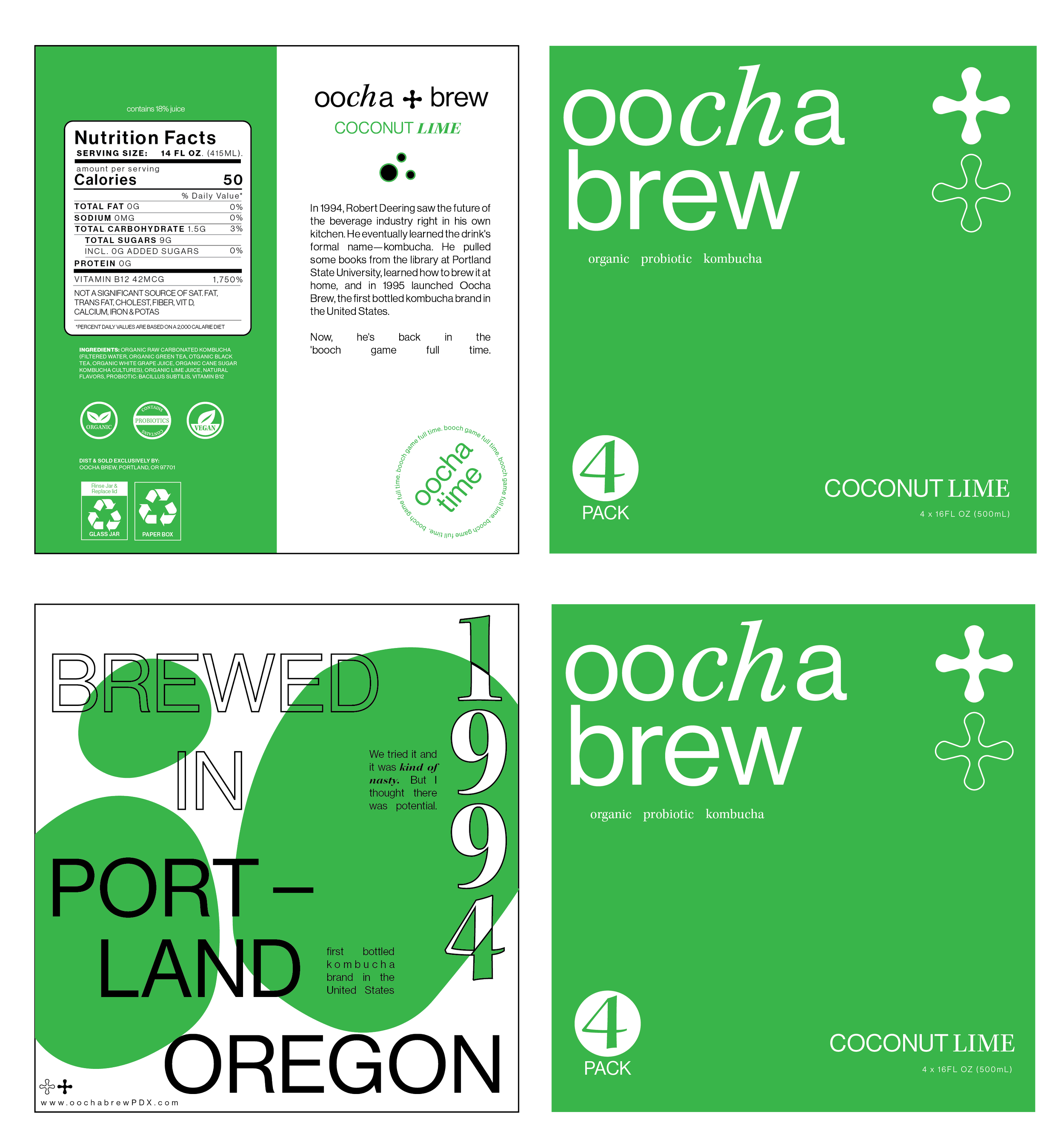
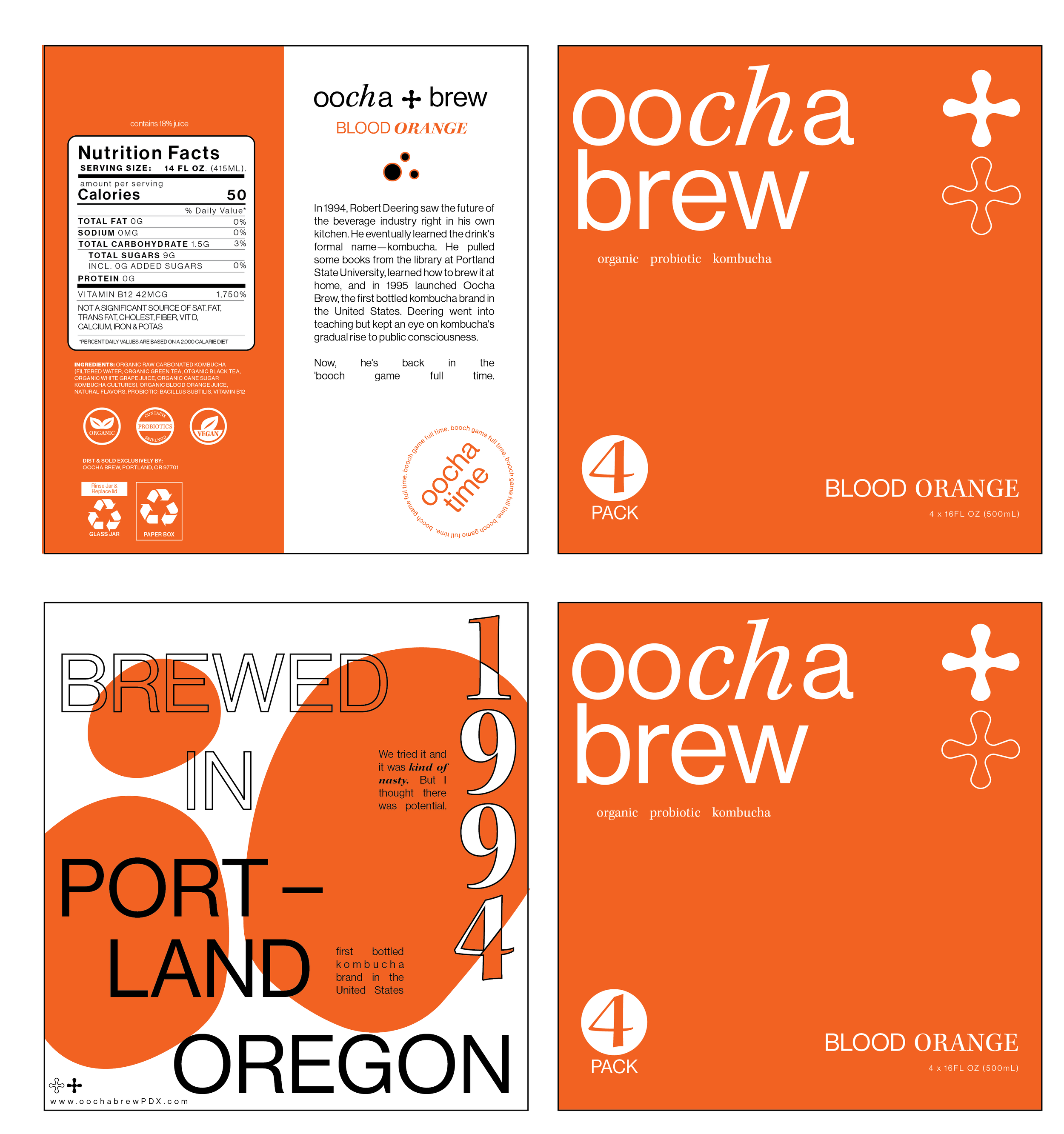
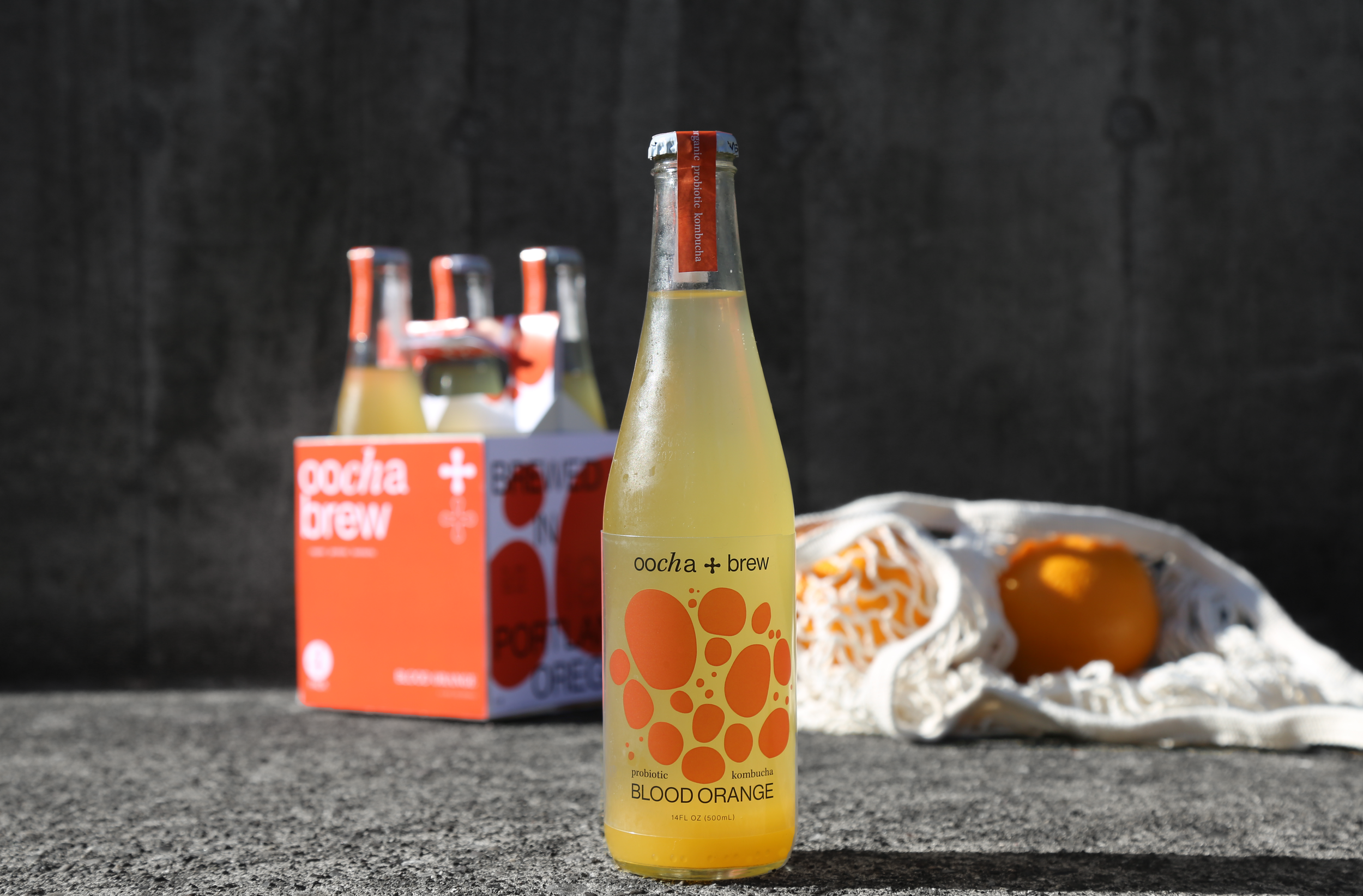
As of now Oocha Brew has two flavors: Blood Orange and Coconut Lime. It was important for me to pick flavors that were popular with Kombucha drinkers. Once I chose the flavors that colors came easy. I used bright, crisp colors that look refreshing and enticing. This sets the bottles apart from the typical Kombucha brands on the shelf with their earth or jewel tones.
The branding is focused on Portland aesthetics, Kombucha’s health benefits, and the fermentation process. I was inspired by the bubbles tat are often seen with this fizzy drink. The bubbles are a versatile pattern and brand element that can be used in a large variety of ways.
The Logo and mix of type helps bring out the “keep Portland weird aesthetic. the change in type face reflects the weirdness as well as the unusual aspects of kombucha itself and how its an unconventional beverage. The mark is inspired by the universal health symbol of a white cross on a red background. I pushed that further with rounded edging to fit well with the softness of the bubbles.